.png?fit=max&auto=format&n=BTEMalYyM0xskXeS&q=85&s=3495b9a1f1230446e6de7883f20fc8cd)
The “Prophecy” Engine (Forecast)
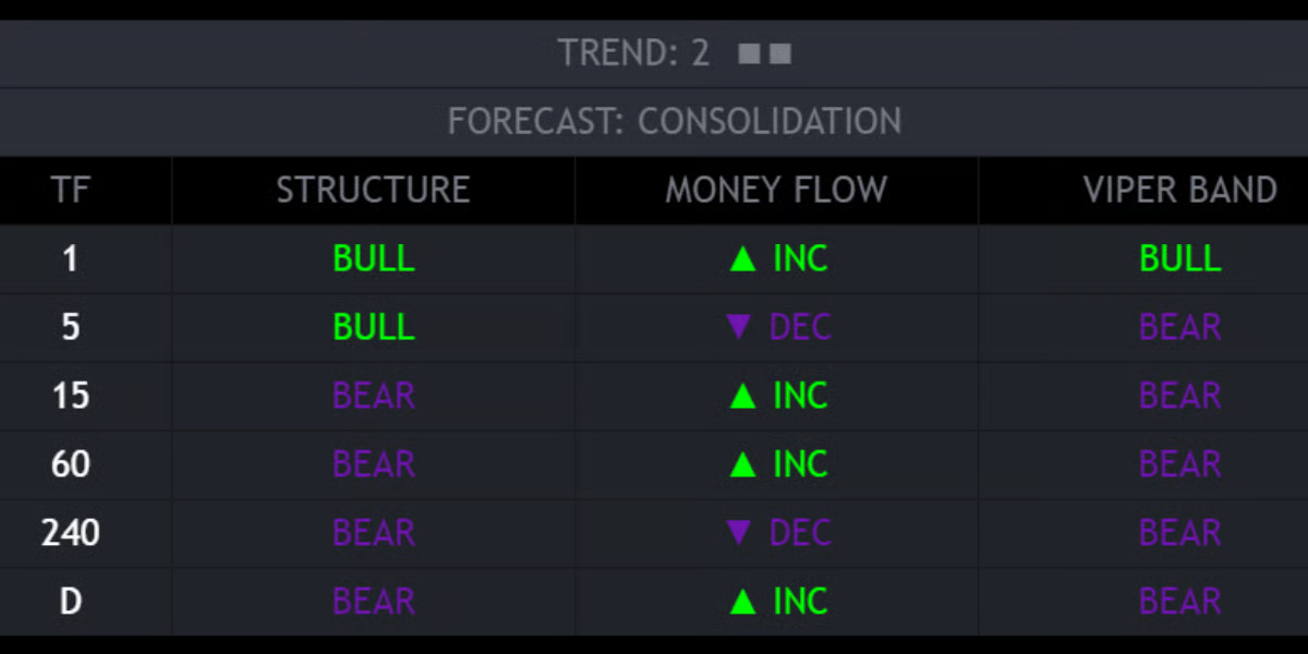
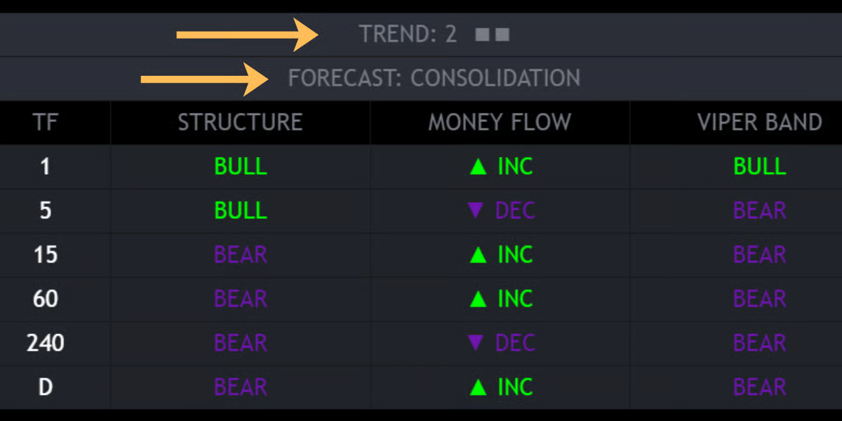
At the top of the dashboard, you will see a dynamic header with a “Trend Score” and a “Forecast.”- Trend Score (1-10): A composite score derived from ADX (Trend Strength) and Directional Index.
- Low Score (1-3): Weak trend, likely chopping.
- High Score (8-10): Parabolic trend.
- The Forecast: Based on the score, the dashboard predicts the immediate market phase:
- CONSOLIDATION (Grey): The market has no energy. Expect choppy price action. Best to use “Smart Grid” support/resistance strategies.
- PUMP (Green): High-momentum Uptrend detected. Look for breakouts and Order Block bounces.
- DUMP (Red): High-momentum Downtrend detected. Look for shorts.
Data Columns
The dashboard grid displays three critical metrics for each timeframe:- STRUCTURE:
- Monitors the Swing Highs/Lows relative to the EMA 50.
- BULL: Market is making Higher Highs.
- BEAR: Market is making Lower Lows.
- MONEY FLOW:
- Monitors the internal Volume Momentum (MFI).
- ▲ INC: Money is flowing into the asset (Buying Pressure).
- ▼ DEC: Money is flowing out of the asset (Selling Pressure).
- VIPER BAND:
- Checks price location relative to the proprietary Viper Band (Trend Filter).
- BULL: Price is holding above the trend baseline.
- BEAR: Price is stuck below the trend baseline.
Customization
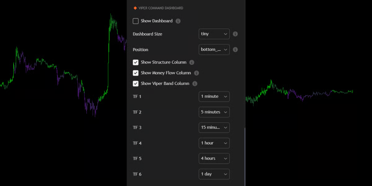
You can fully tailor the dashboard to your setup in the “Viper Command Dashboard” settings group:- Timeframes: By default, it tracks 1m, 5m, 15m, 1H, 4H, and Daily. You can change these to any timeframe (e.g., 3m, 2H, Weekly) to match your strategy.
- Size & Position:
- Size: Scale the UI from Tiny (for mobile) to Huge (for 4k monitors).
- Position: Move the panel to any corner (Top-Right, Bottom-Right, etc.) to avoid covering your candles.
- Column Toggles: You can turn specific columns (like Money Flow) on or off if you prefer a simpler view.